COMPLETELY CUSTOMIZED WEDDING

|
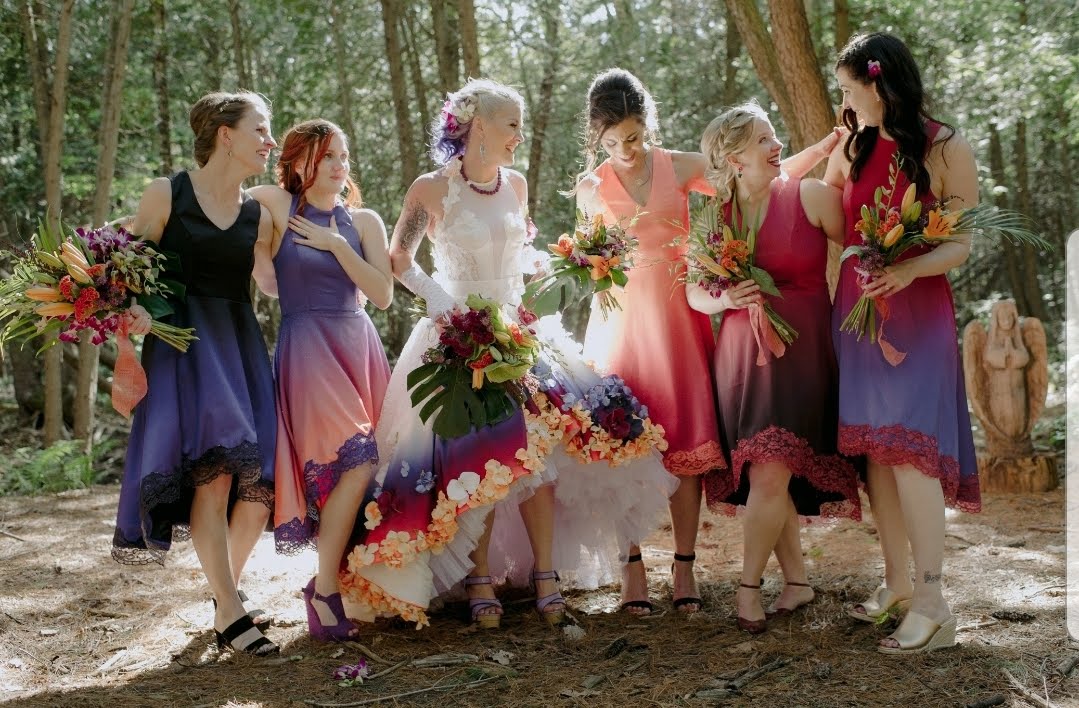
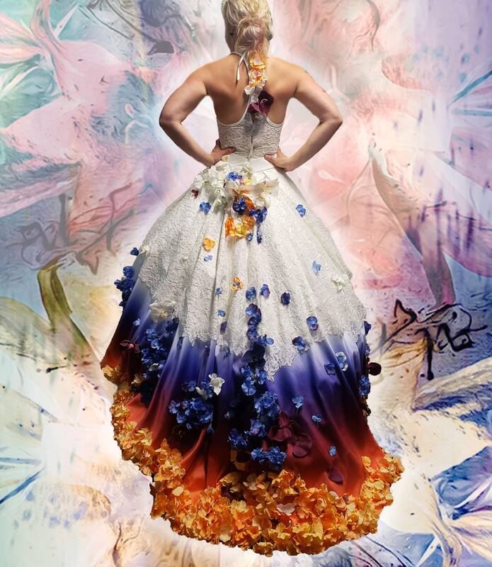
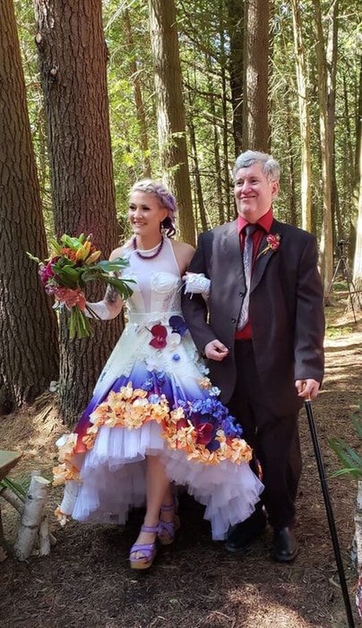
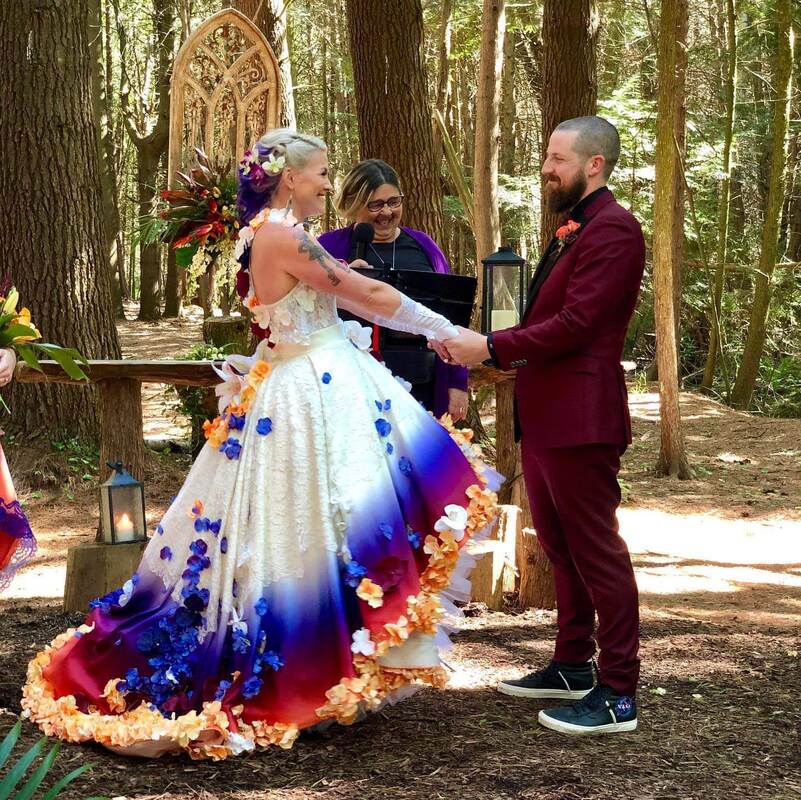
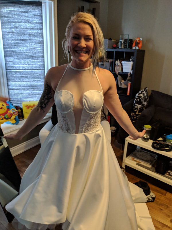
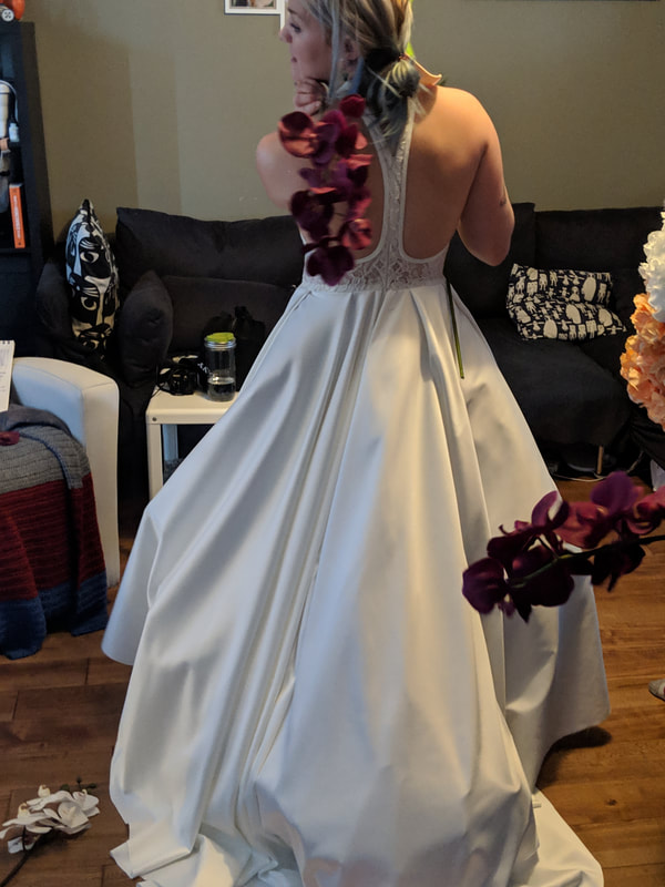
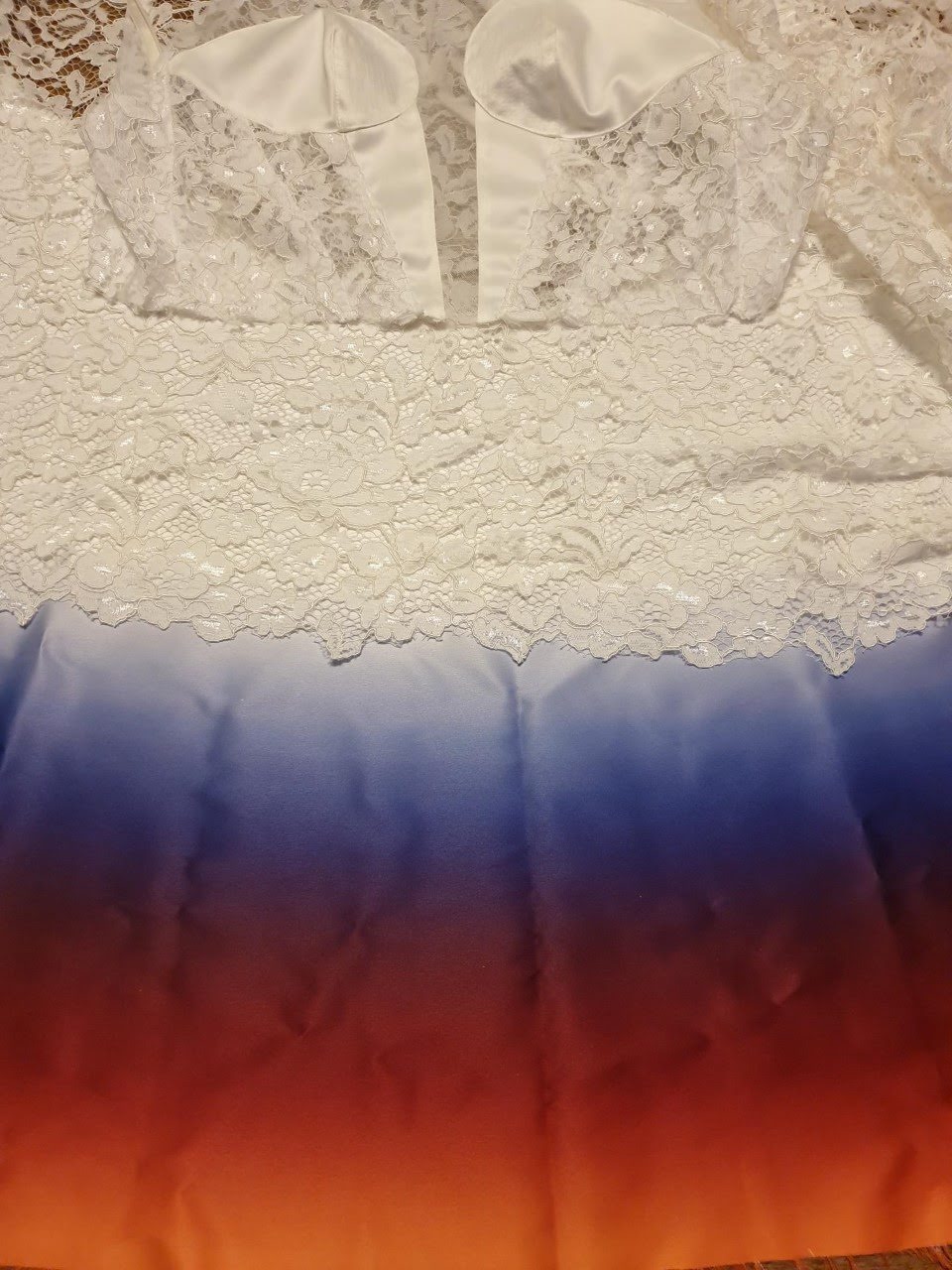
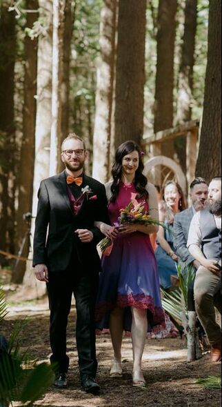
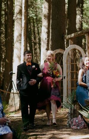
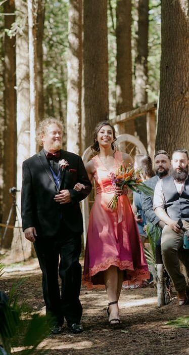
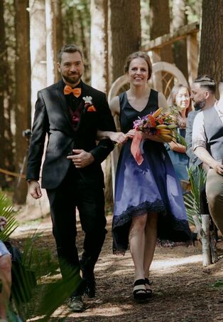
I adore colour. Also ombres, aka gradients, aka fades. Upon being proposed to in Lucerne, Switzerland by my Babe, I was fairly immediately imagining the fashion that would be worn by us & our closest friends and family for our celebration. Here is the predominantly visual tale of the process. 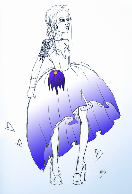 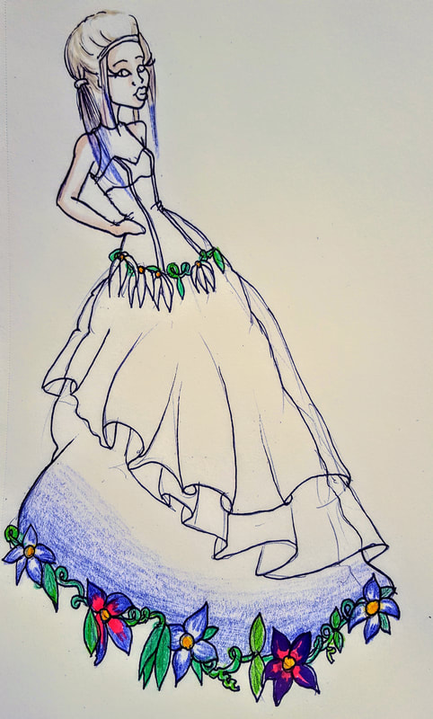 It started with a few quick sketches, along with some other slightly wild concepts... 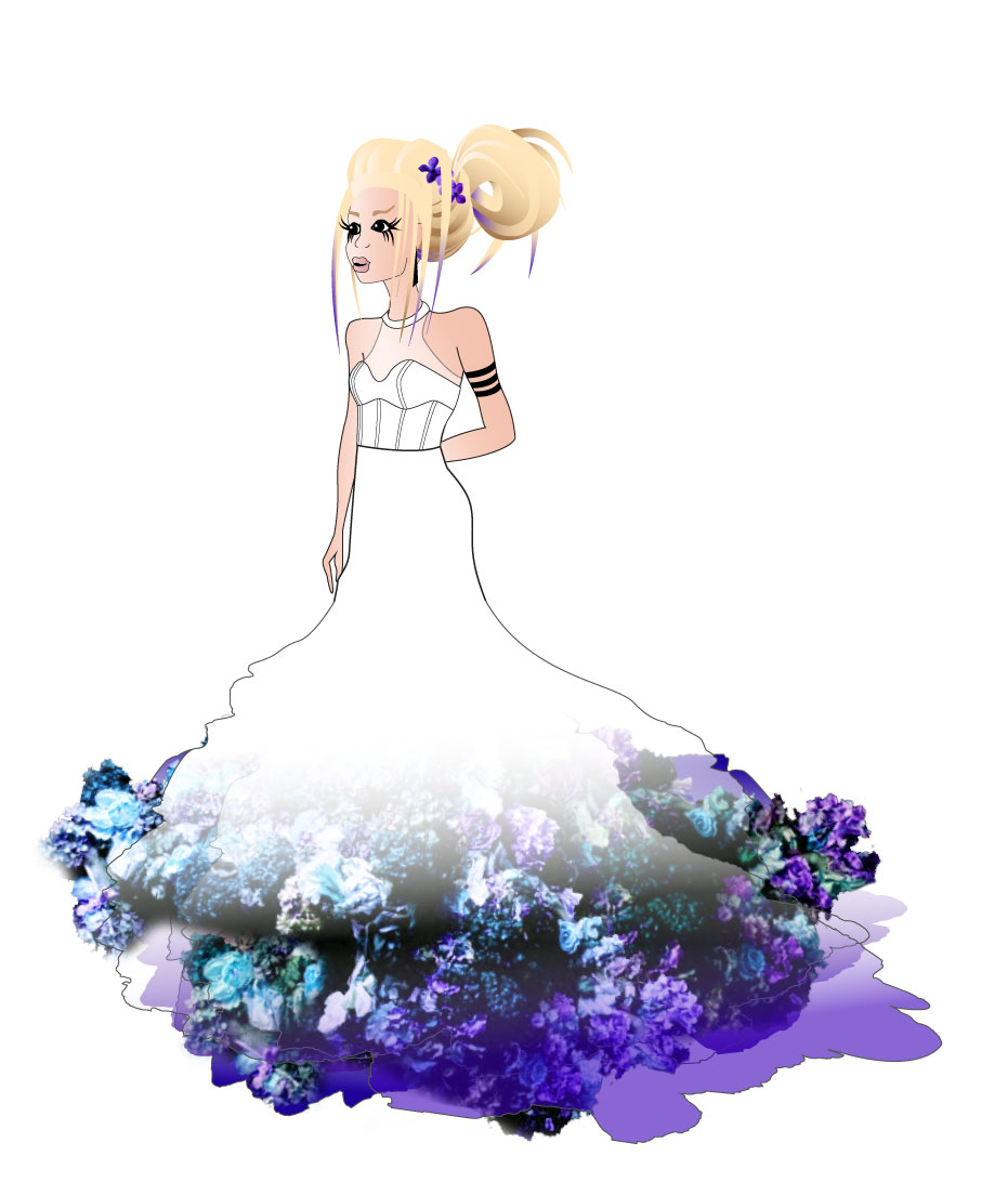 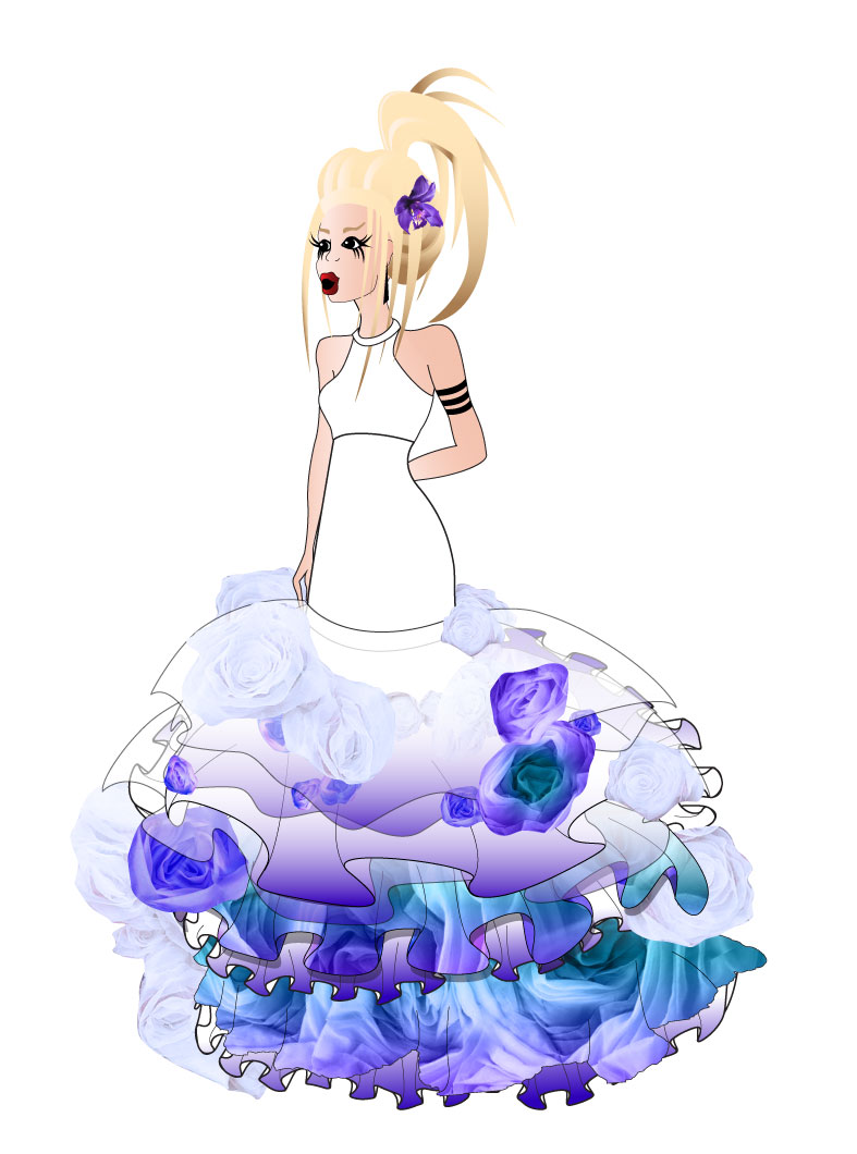 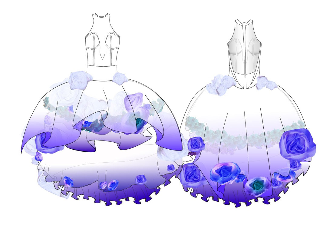 mermaids of honourSimultaneously I started mocking up what my best ladies would wear. 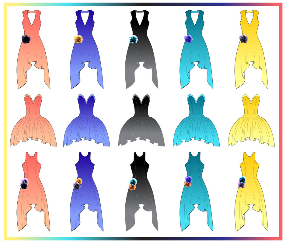 The original colour scheme had way too many colours involved. I soon updated the palette to a much more agreeable combination. 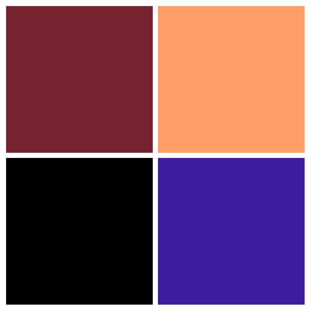 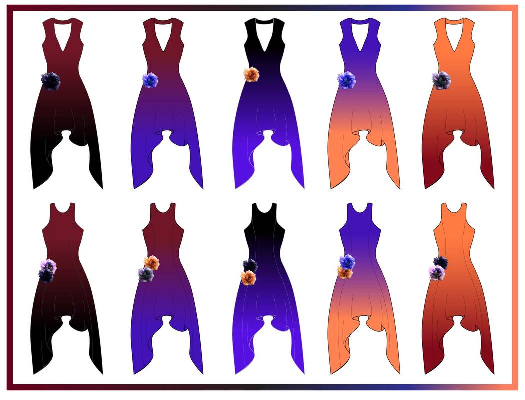 THIS WAS IT! My key advisers agreed! Certainly, my mother's dress would be custom as well. The middle one was chosen. 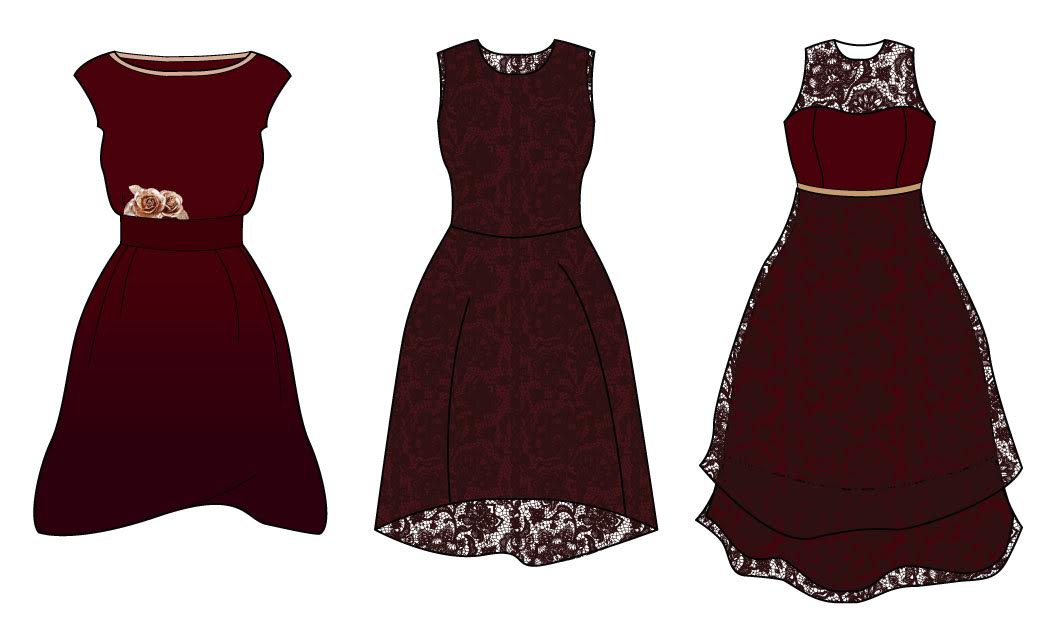 And thus it was time to run colour tests. This is one of my favourite tasks. I love the anticipation that comes along with putting paper and fabric through the transfer machine, and awaiting the result on the other side. I'm always confident that I selected the proper colours digitally. The primary test did not disappoint! 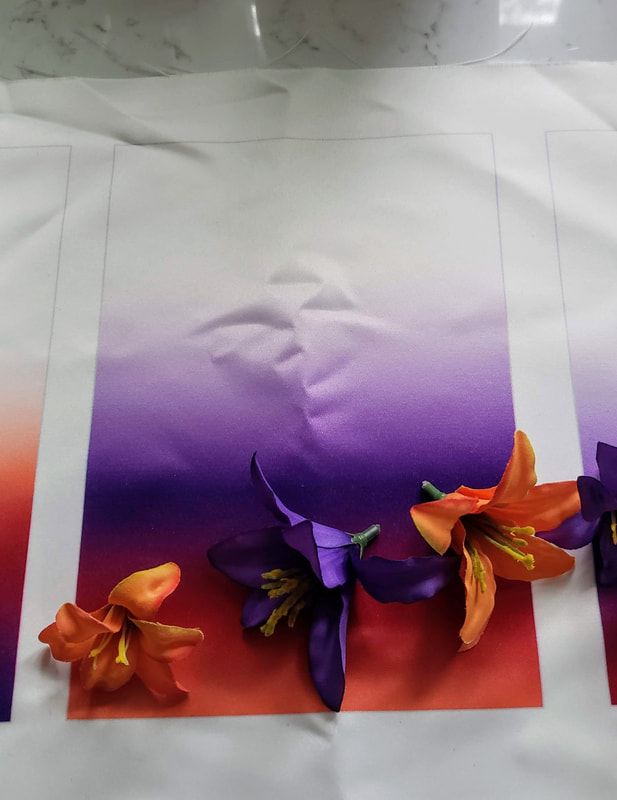 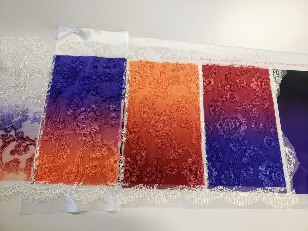 As my prior experience sublimating fabrics was limited to sportswear fabrics, i.e. athletic stretch knits and fleece, this successful transfer of silky poly and textured lace was truly a delight. I was particularly impressed with how beautifully the purple to orange ombre turned out. Up next, first fit! 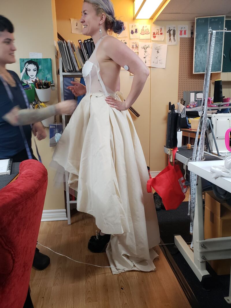 Muslin is not flattering and the feel of it is not so luxurious. It is super cheap for first fits and helps you visualize and test the overall fit and drape of the entire garment. 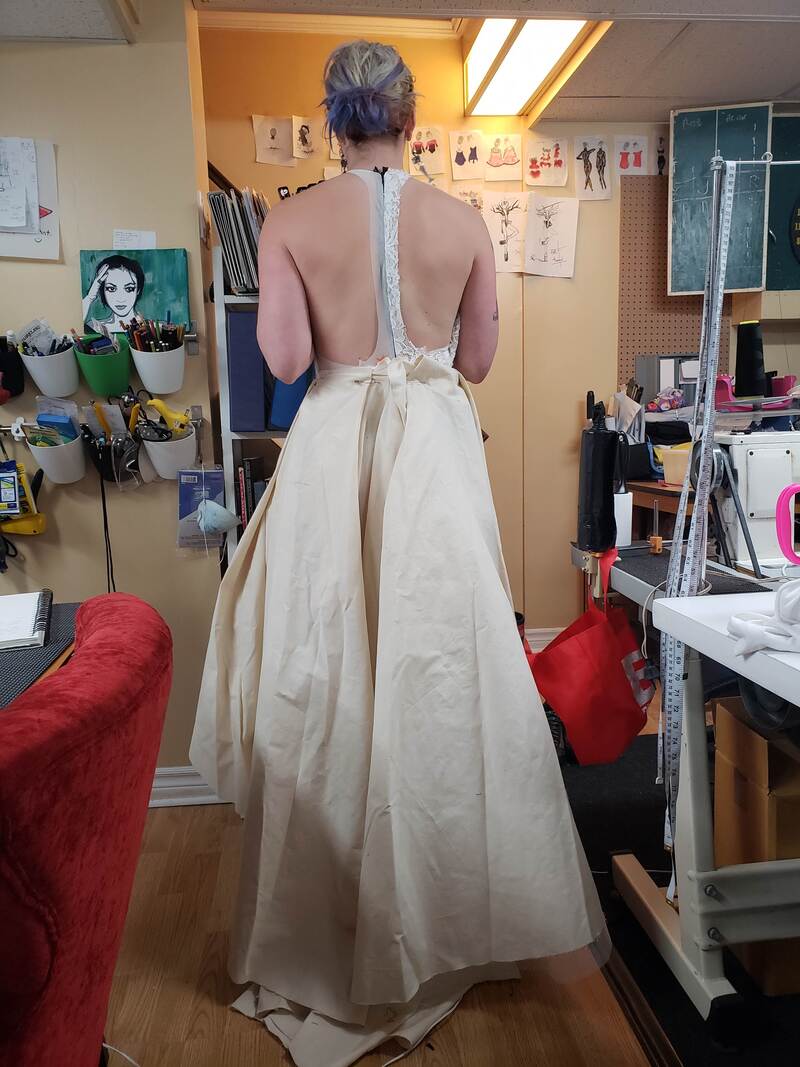 I had to go racerback. It's just my jam. At this point I was feeling pretty good about the decision to go high/ low. Translation: The skirt is higher in the front, and drapes down much lower in the back. This means more freedom when walking, more leg and heel showing, an interesting profile view on the diagonal, while maintaining the ability to include an impactful train at the back. The following fit was in the real fabric, but it was in all white. I was craving the color inclusion! 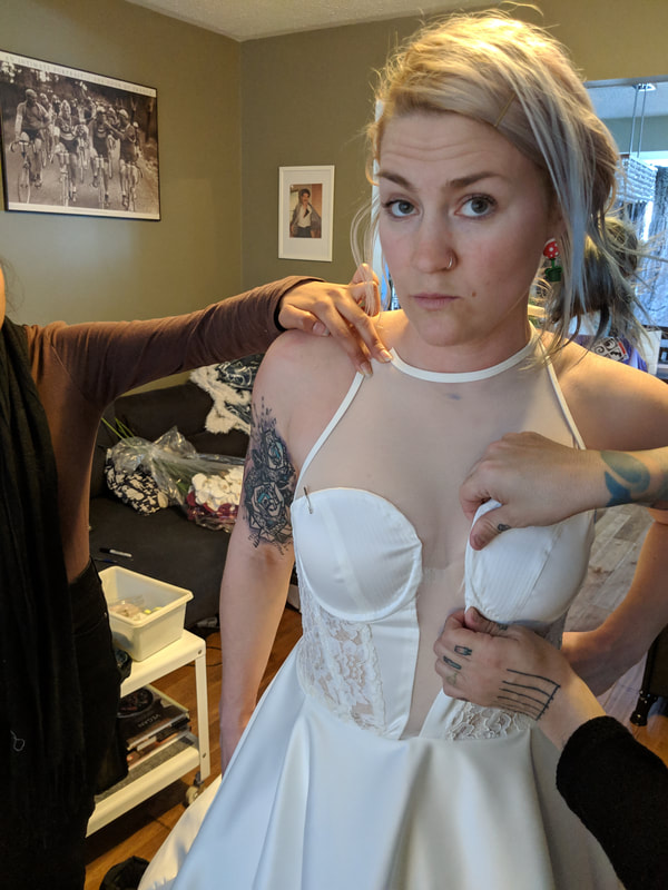
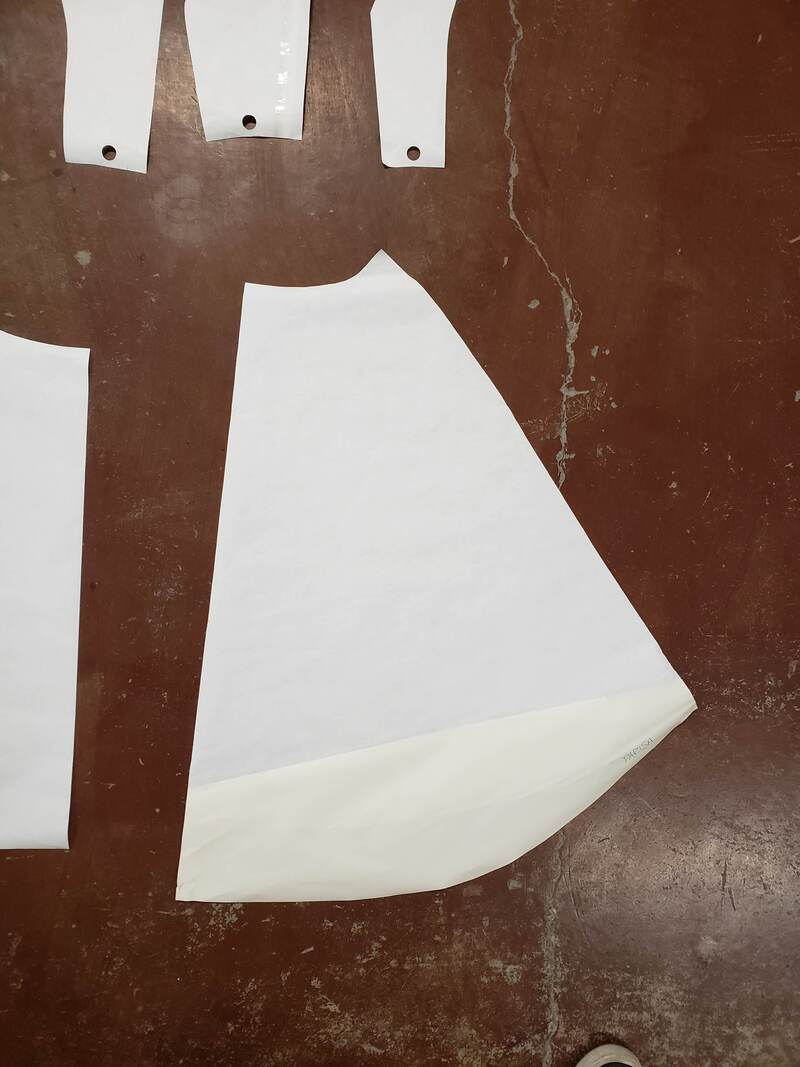
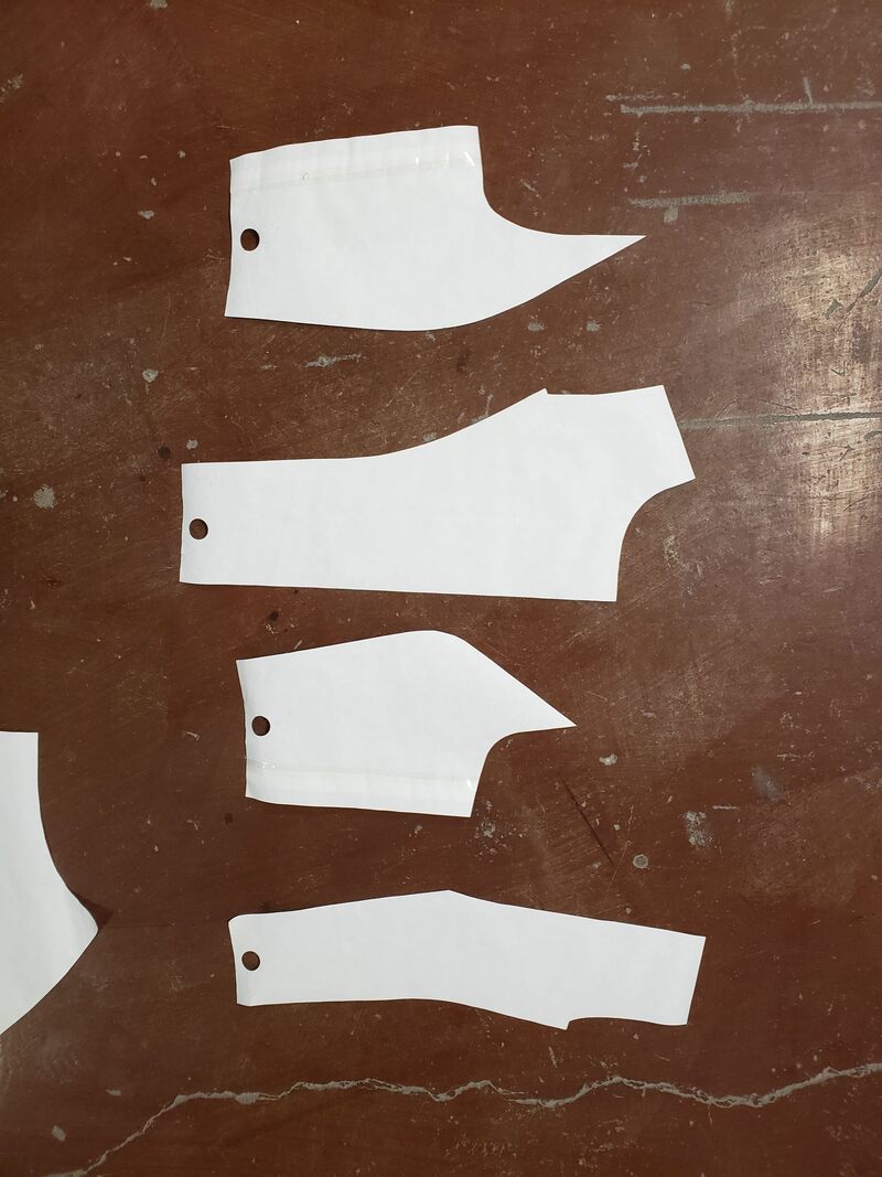
time to turn paper patterns digitalThere's a few different ways this could be achieved. Due to the size of my skirt pieces, I chose to photograph the paper patterns lying flat on the floor and take certain measurements to ensure the scale was accurate once I imported them into Adobe Illustrator for digital tracing. 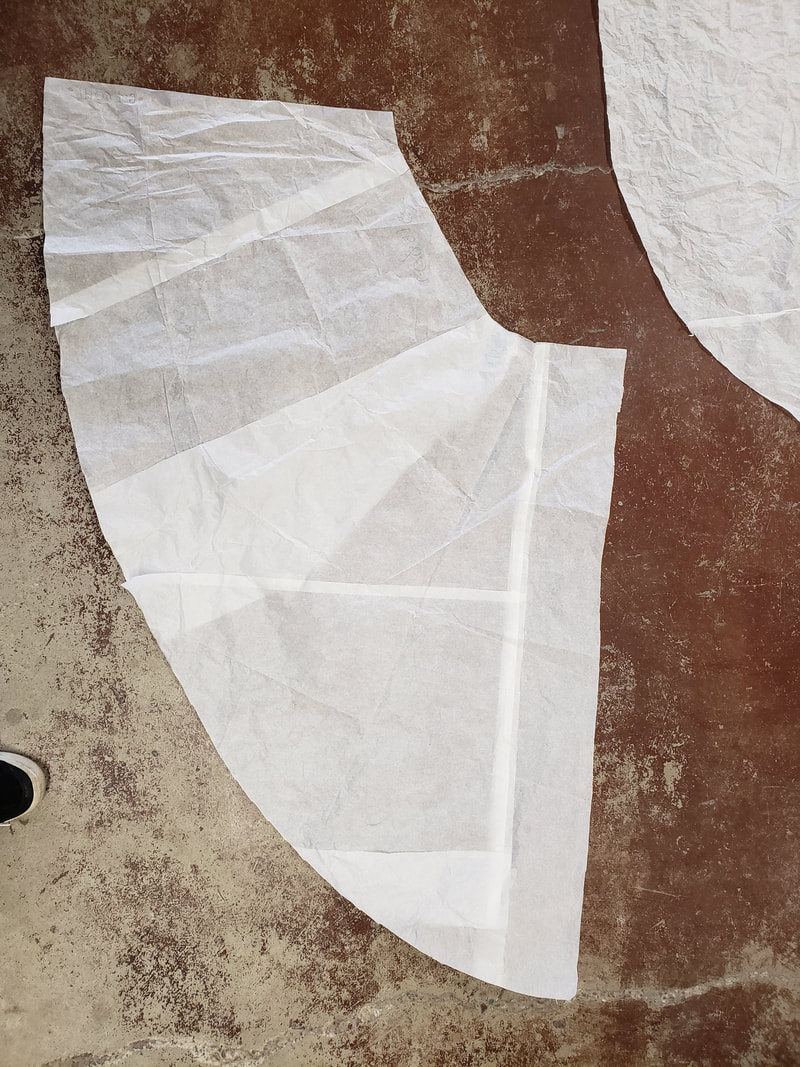
I traced these exact patterns in Illustrator and then double checked the measurements. Then I was able to fill each shape with the appropriate gradient. 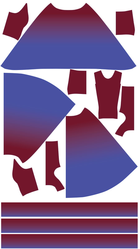 For the mermaids of honour I was able to use a simple 90 degree linear gradient tool. The most important factor being where I set the slider in between the two colours so that the perfect amount of gradiation could be achieved.
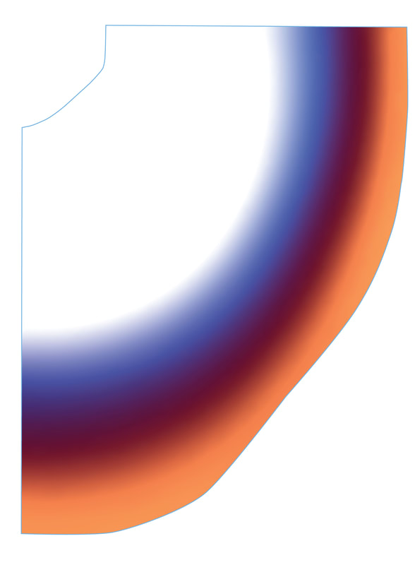
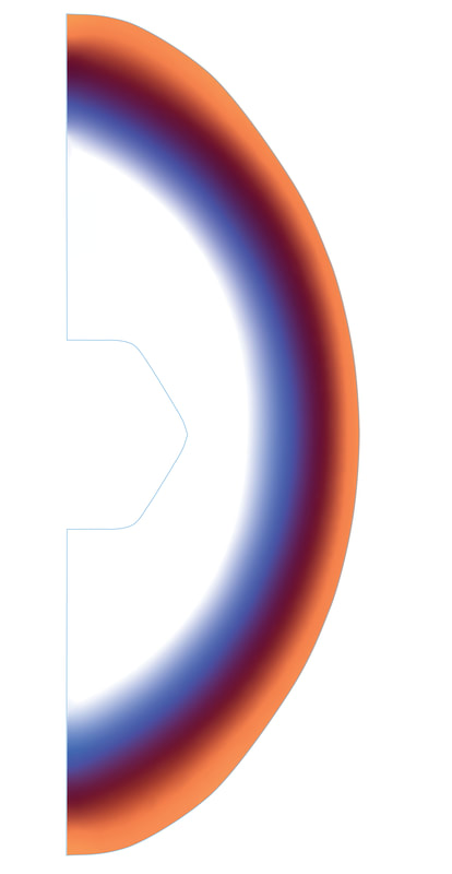
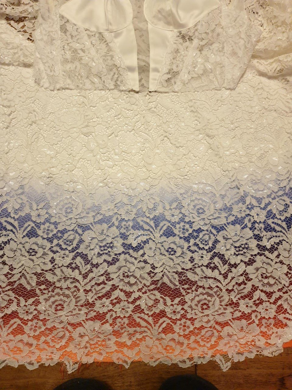
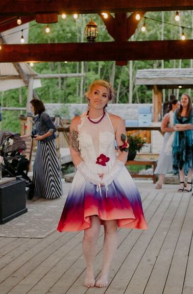
The gradient on my skirt proved to be much more complex. I ended up using the Freeform Gradient tool which was introduced in the CC - Creative Cloud version of Illustrator, I had to manually draw the circular lines following the shape for each colour of the gradient. The tool does not allow you to reflect the gradient, so I had to keep each side of the front as consistent as possible by hand. Depending on where the points of colour in the gradient lines were placed, it would alter the colour. 5 bridesmaid dresses and 1 wedding dress worth of pattern tracing later, I was ready to send to print. (AND ALSO A NERVOUS NIGHTINGALE!) 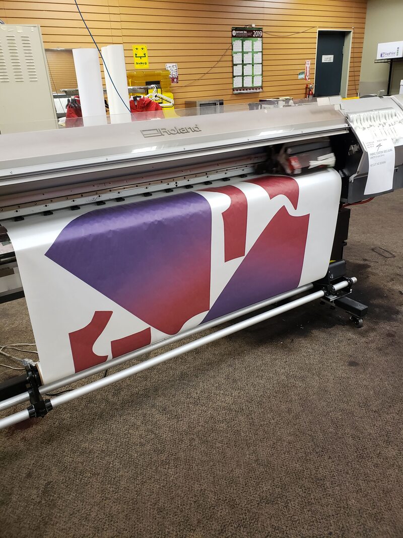 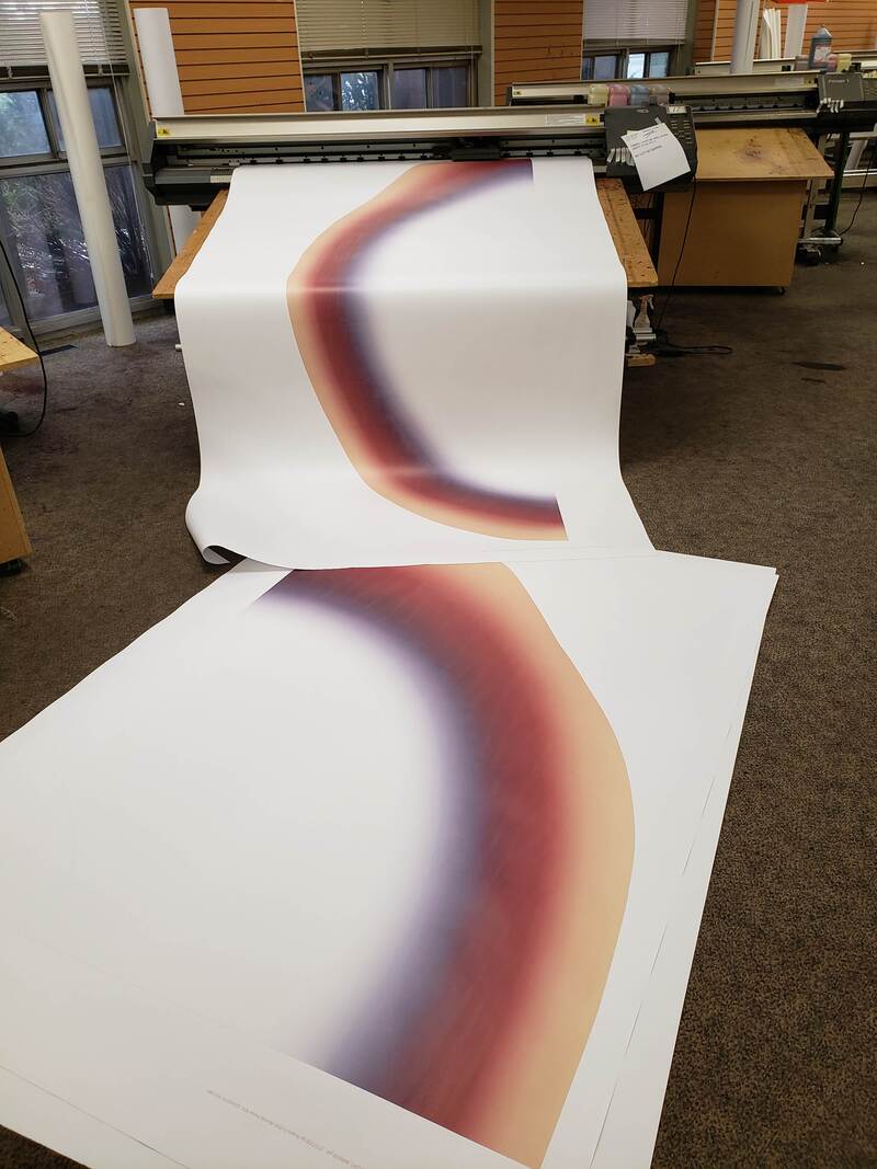 The printers are 62" wide, so luckily my skirt just fit. The ink used is specific for sublimation printing. The color of the ink is often quite different than the end result transferred on the fabric. The next step had the greatest chance for error but the highest immediate reward. There are many things that could go awry during the transfer process: fabric folding on itself if it's not perfectly flat, thread/ dirt gets transferred into the fabric, the tissue paper leaves marks, the ink bleeds due to over saturation. The time and temperature are regulated and important to a successful result. I had to hope for the best and place the precious pure white skirt pieces face side to the inked paper side, and send them on through... 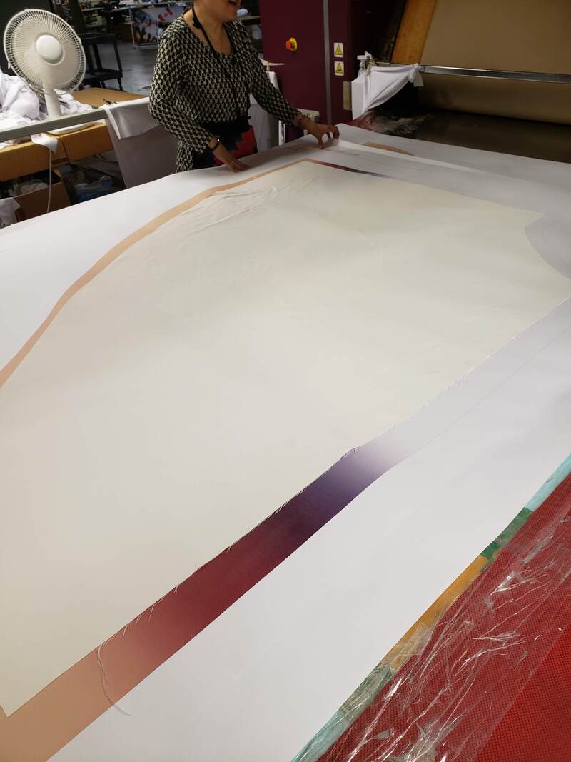 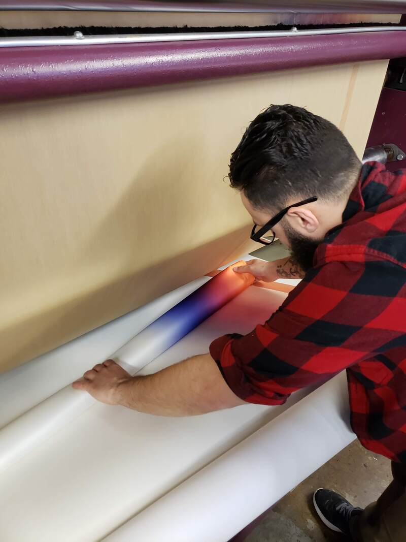 OK, this was a wonderful sight! Sunset palette perfection! The fabric has to be peeled off the paper as it comes off the transfer machine. Next, to lay it out and see the full result. 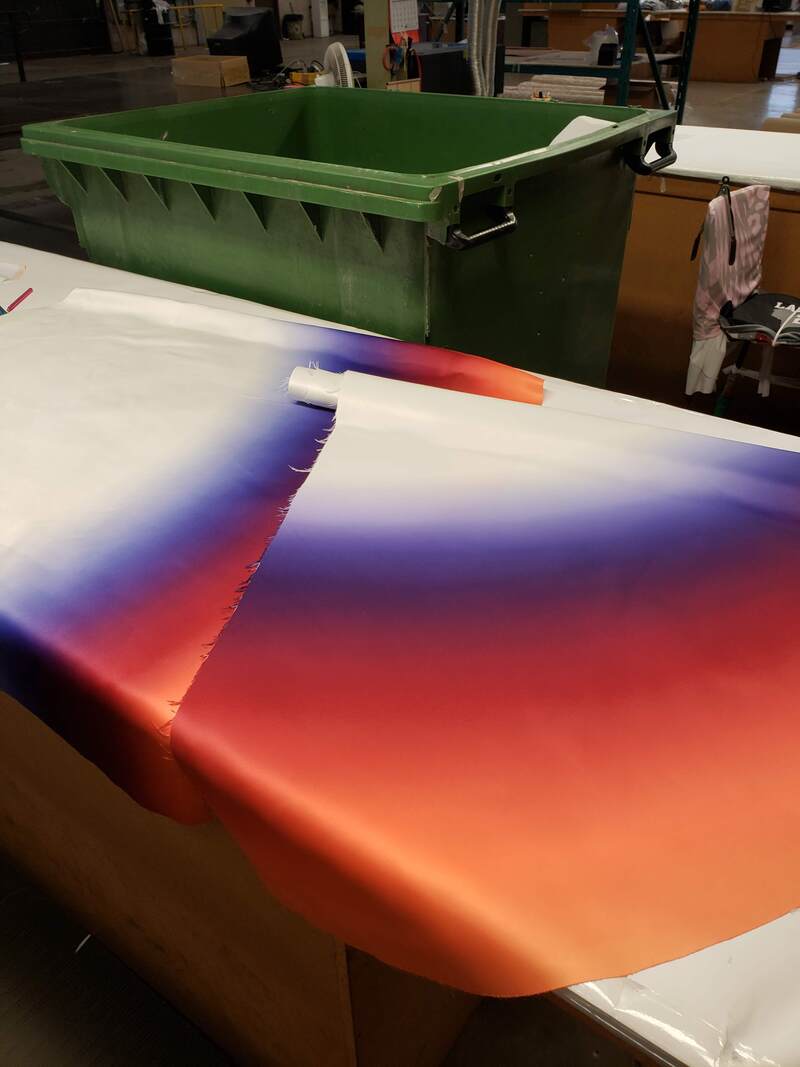 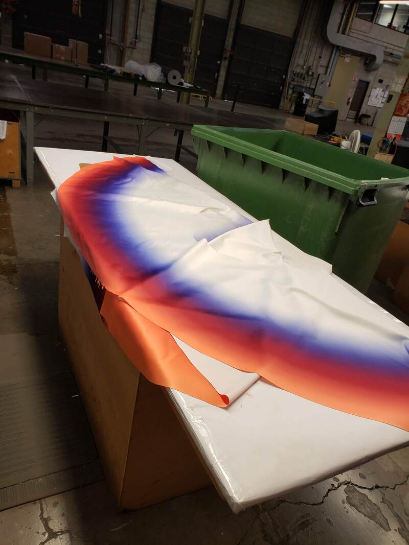 Oh, sweet relief, it was a success on the first try! As were the bridesmaid's, which were transferred altogether on a roll of fabric, matched up with the roll of paper, including each of their custom fit pattern pieces filled with their individual ombre. These pieces were cut after the transfer. 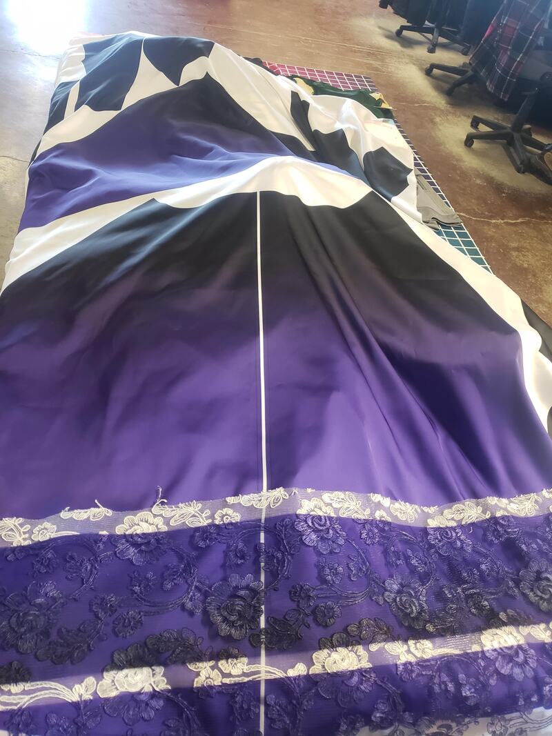 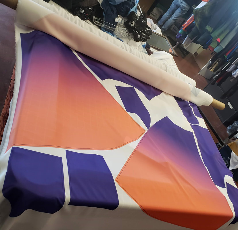 I was elated with the color and gradiation results, The purple to orange created a lovely pink shade in between the two colors. My sister and co mermaid of honor would certainly rock this! As luck would have it, said sister flew in from New York to surprise me for my (also a surprise) bridal shower! Hence an impromptu in person fitting was arranged. 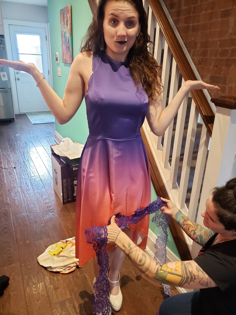 To match lace or to go contrast? 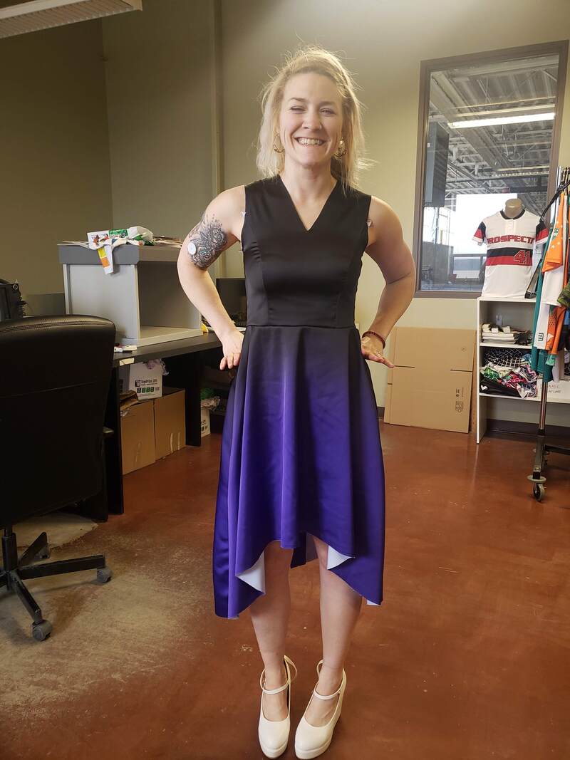 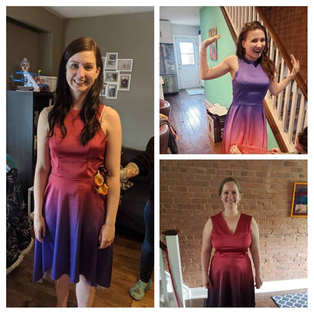 4 out of 5 bridesmaids were able to have a fitting prior to the final finishing elements - lace, liner, zipper, hems. Meanwhile, faux flower selection from CMC Wholesale ensued for my skirt. The layout of color separation per aisle allowed super shopping efficiency. 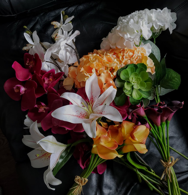 The quality was unreal too. Especially the orchids. Before flowers could be tacked on, I made a sudden realization that I did in fact want lace on the skirt portion. The questions was, to stop the lace before the ombre began, or cut the lace the full length of the skirt, making the ombre more subtle, but creating more texture.
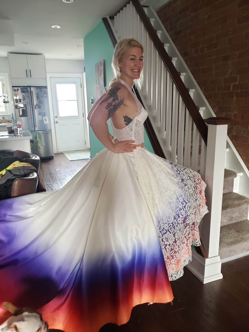 Inevitably, I had to show the full vibrancy of the ombre. FREE THE COLOR!
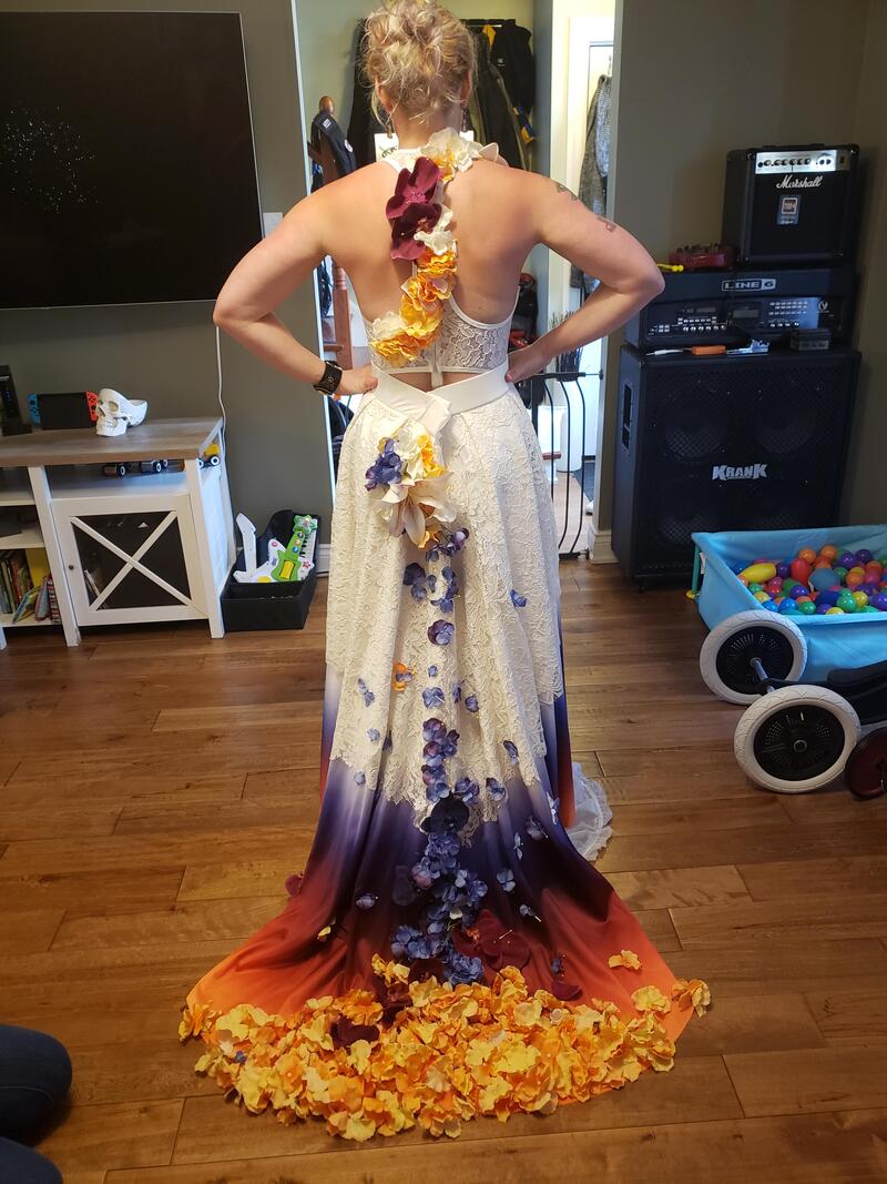
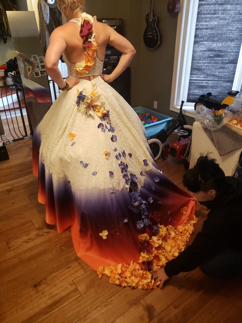
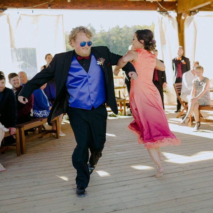
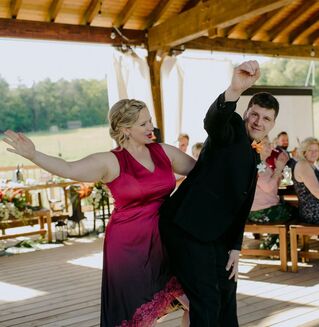
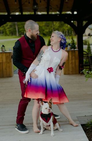
The concept for the flowers was cascading with the hem full all the way around. Cat found the perfect shade of purple petals to include as well. 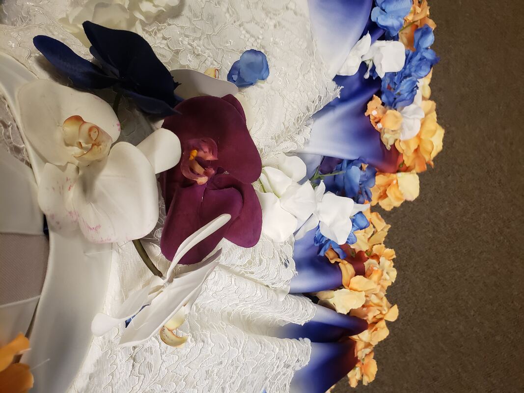 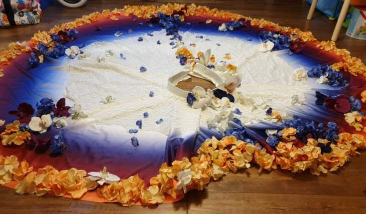 At this point..WOW. The men needed to compliment the boom of colour that the ladies would bring. 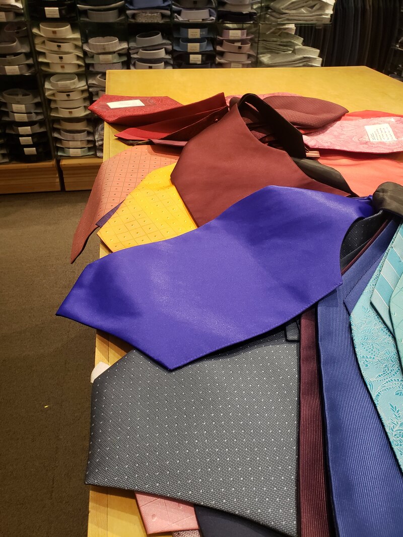 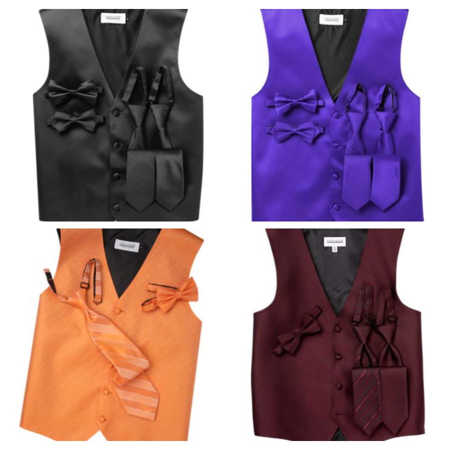 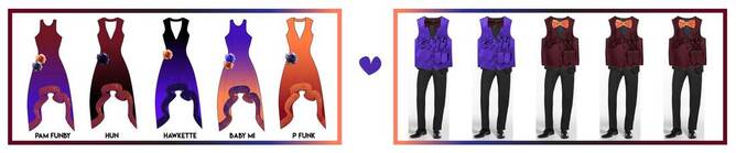 Luck would assist as it turns out the tux rentals offered almost precise shades of purple, burgundy, and light orange that was needed for the fully coordinated bridal party ensemble. the best bud!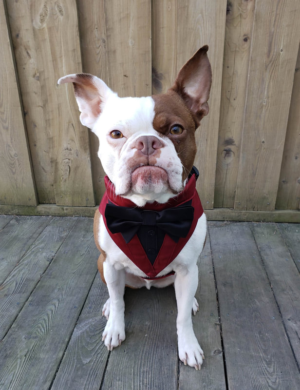 Also a custom design - the best bud Snicker's tuxedo! Made by https://www.etsy.com/ca/shop/OliviasDoggieDesigns A photo of the burgundy tux fabric used on my soon to be husband's tux was sent in, and Olivia's Doggie Designs matched the colour and fabrication perfect. final fitsThe wedding was 1 week from happening. INTENSE! 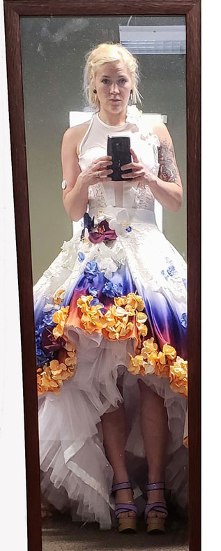 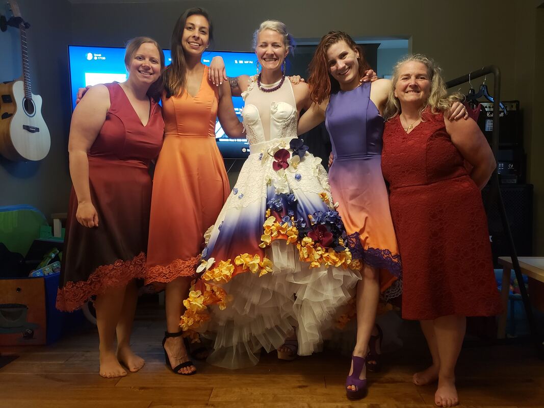 With a few last minute tweaks..the fits were perfected! Fashion is a GO! babes unite...it's official af!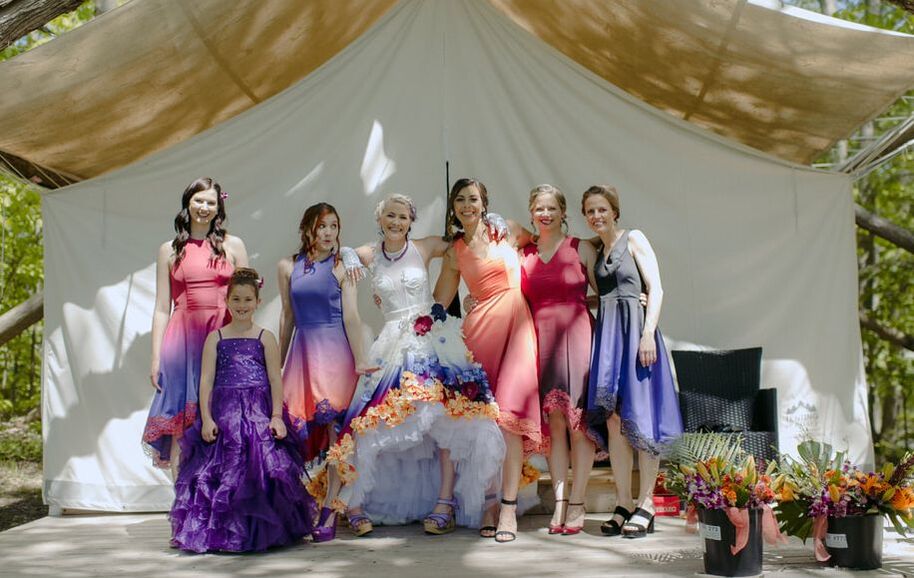 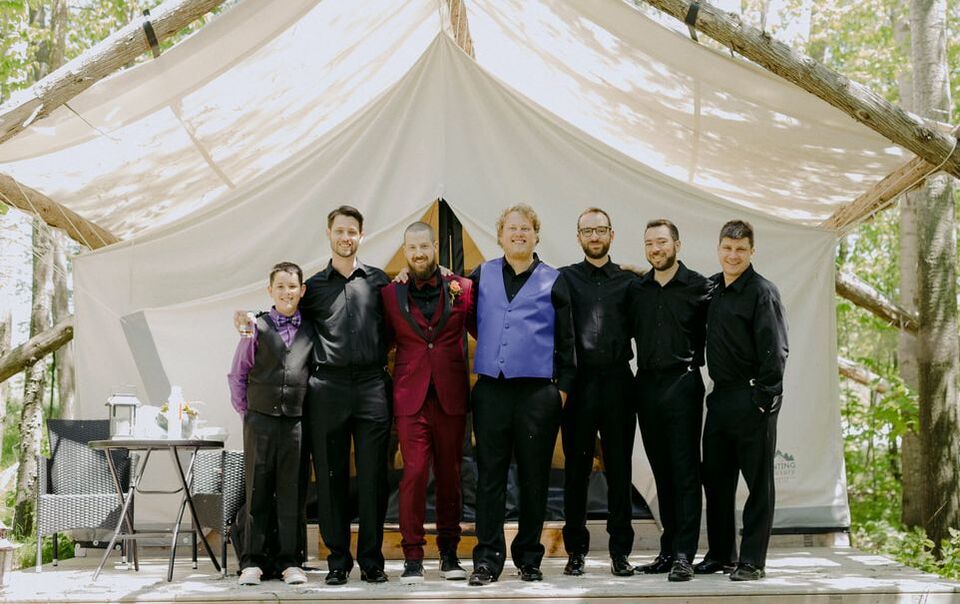 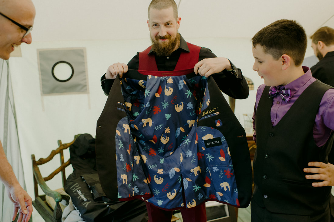 Custom tux with sloths in nature lining! 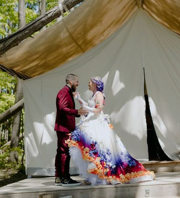 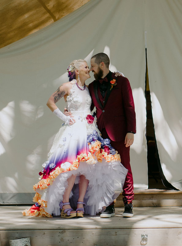 FIRST LOOK! Brock did not know anything about what my dress was going to look like. The only thing I told him was that it was "not typical." 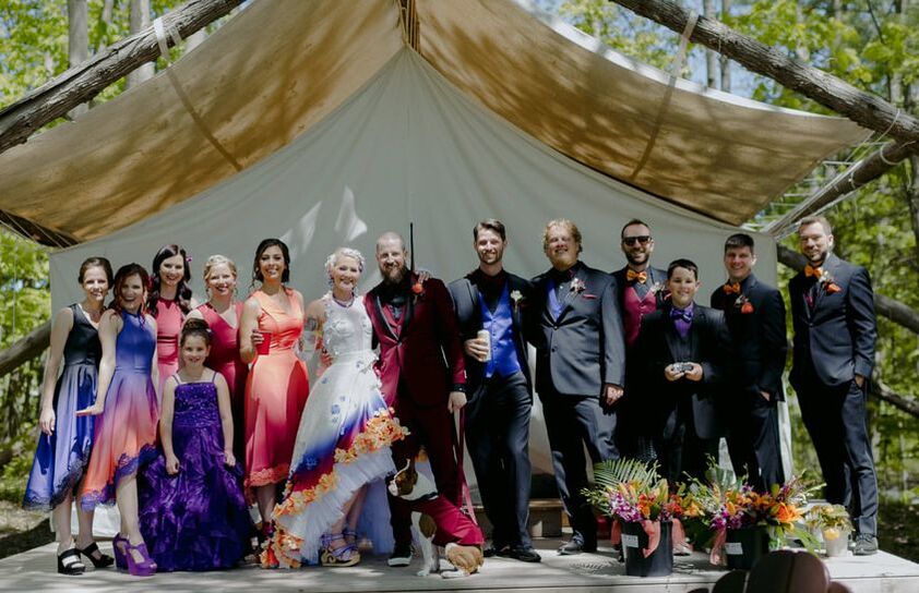 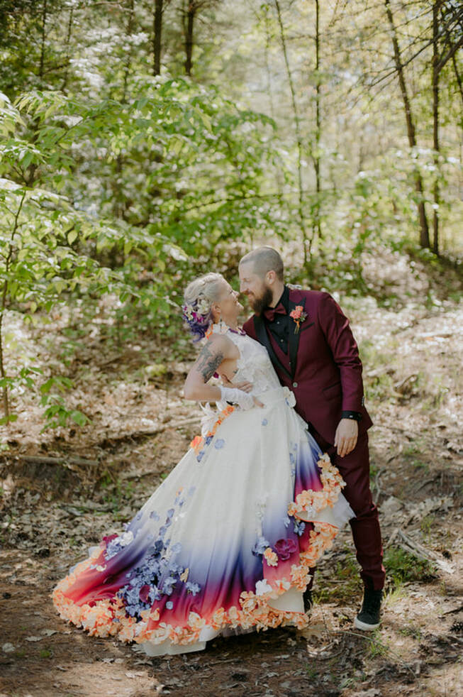 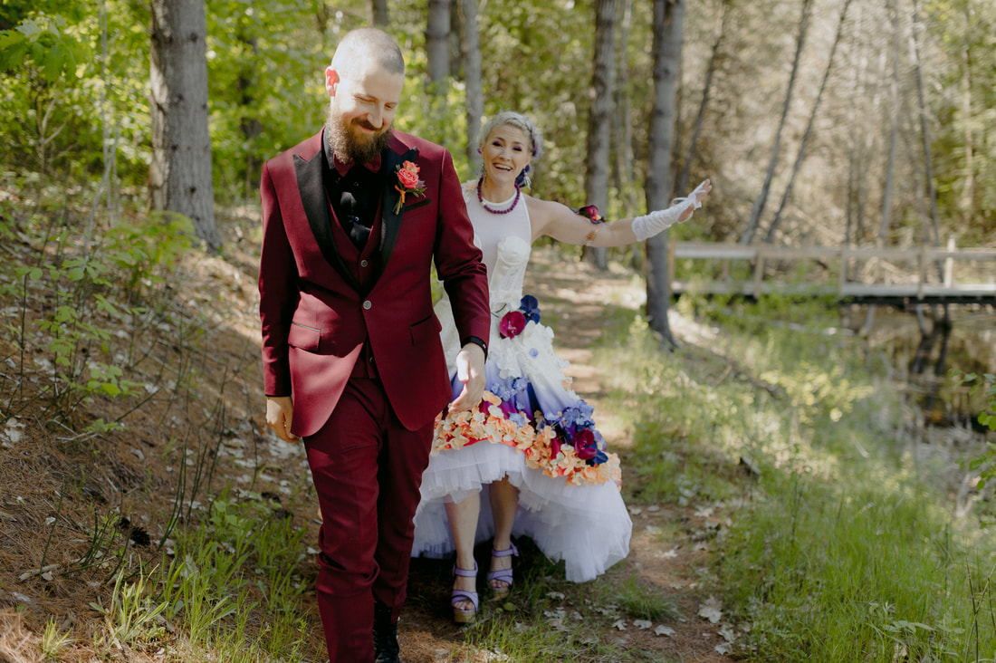  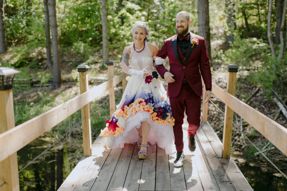
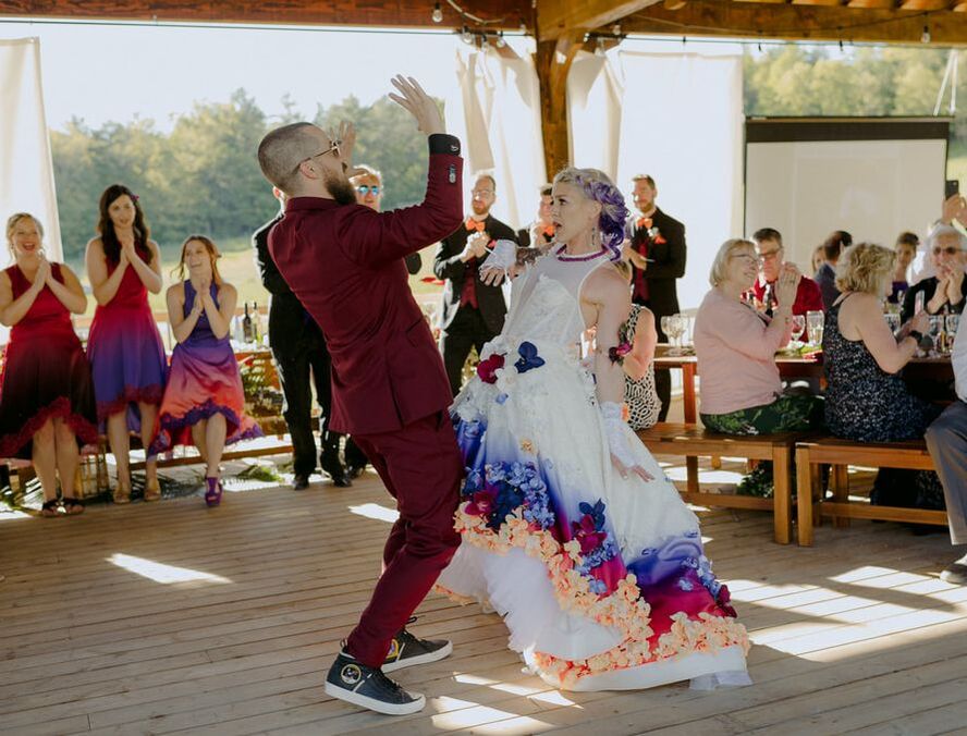
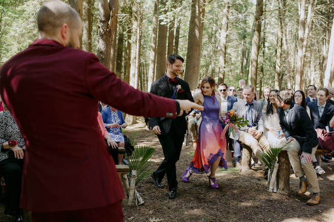   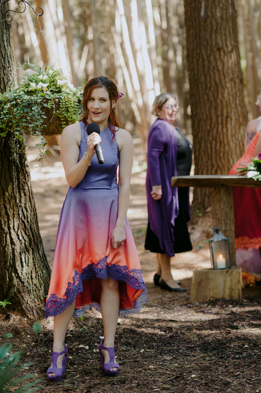 My sister sang "In the Summertime," originally by Rural Alberta Advantage during the ceremony. 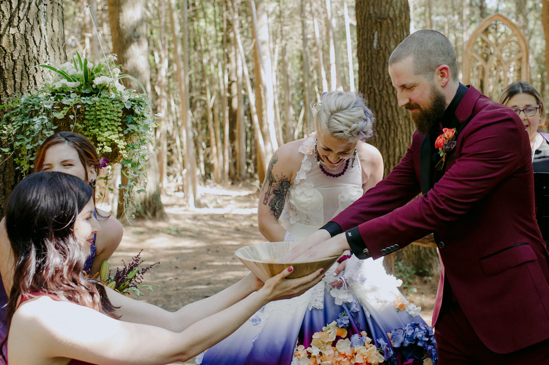 As per tradition, Brock dipped his hands in the Butterscotch pudding making this a great day for Canada and therefore the world. Pam was a fantastic presenter of said pudding. 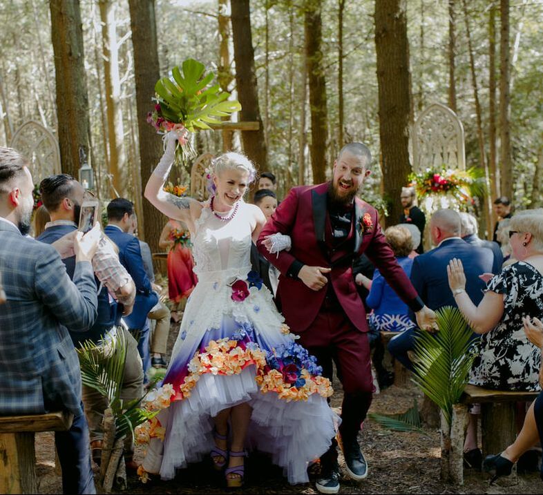 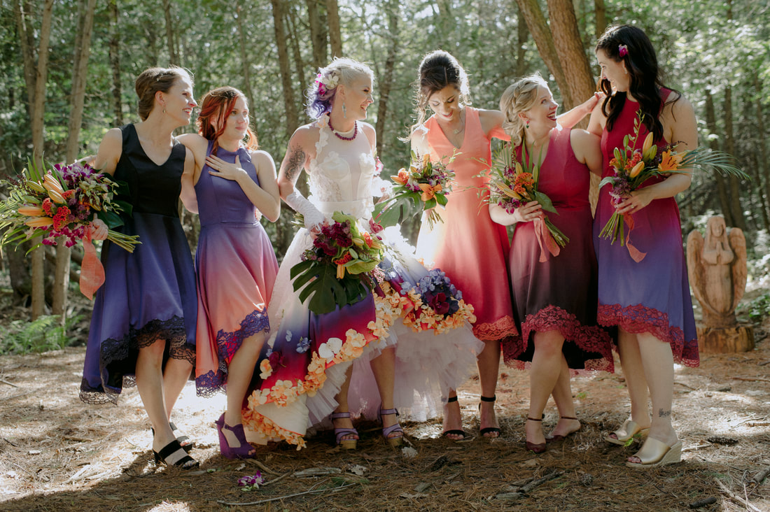 MY MERMAIDS OF HONOUR WERE PERFECT! 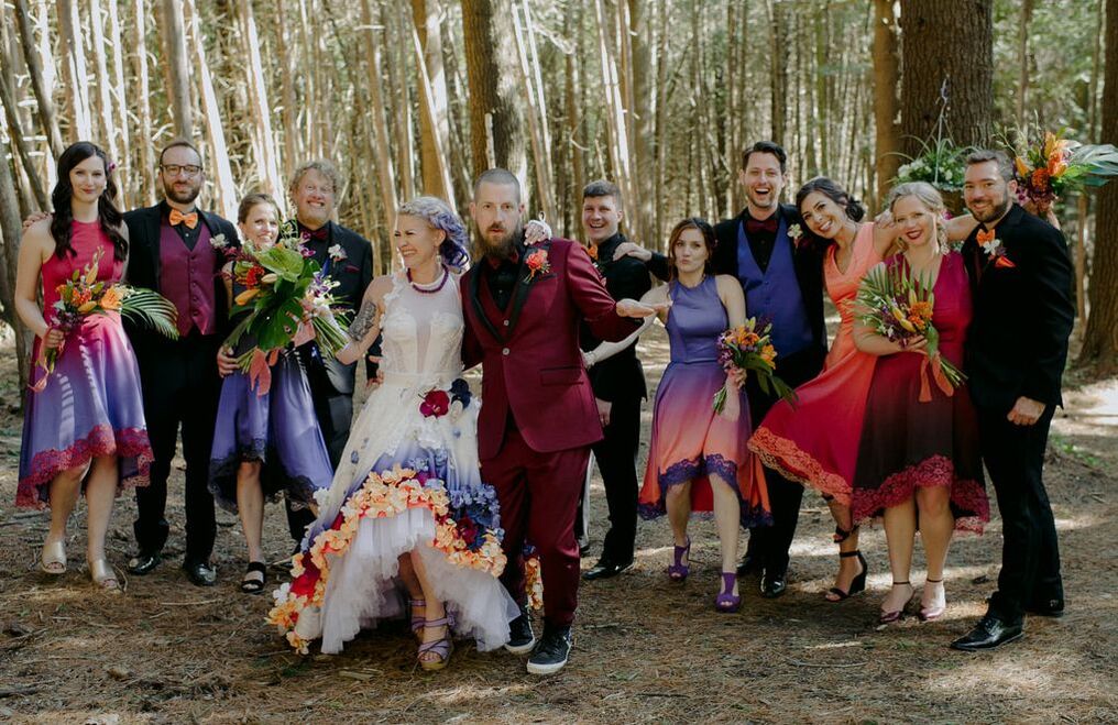 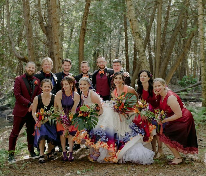 The colours against the forest backdrop really popped. POP! POP! 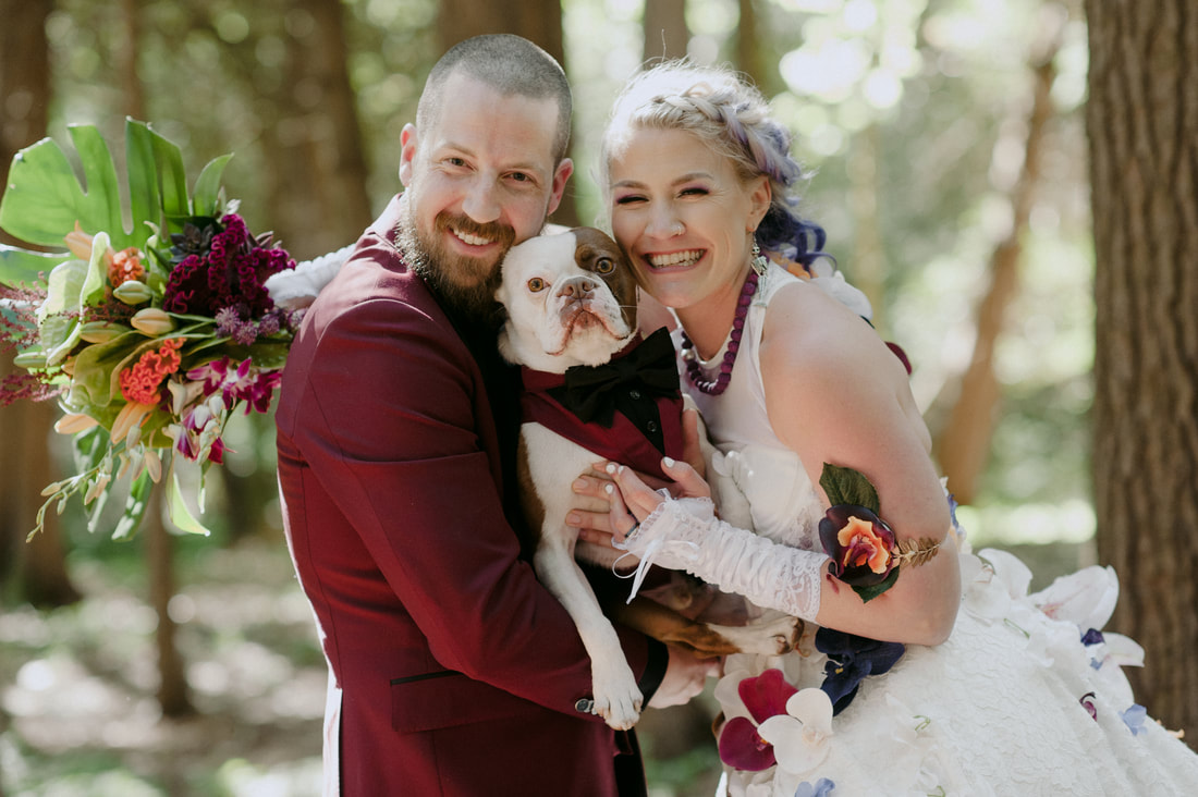 THE PACK
  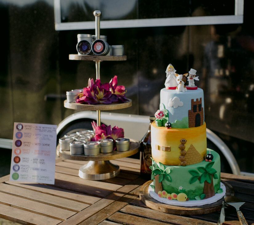 Mario worlds cake created by @joniandcake 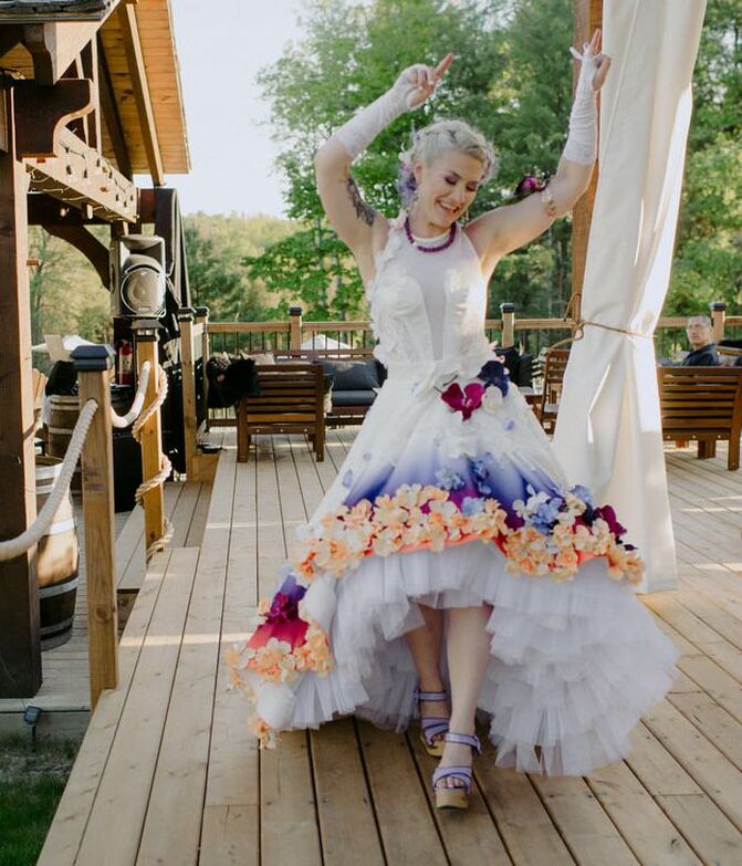
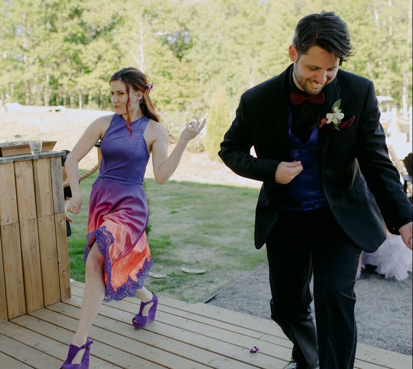
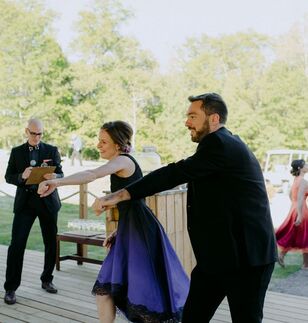
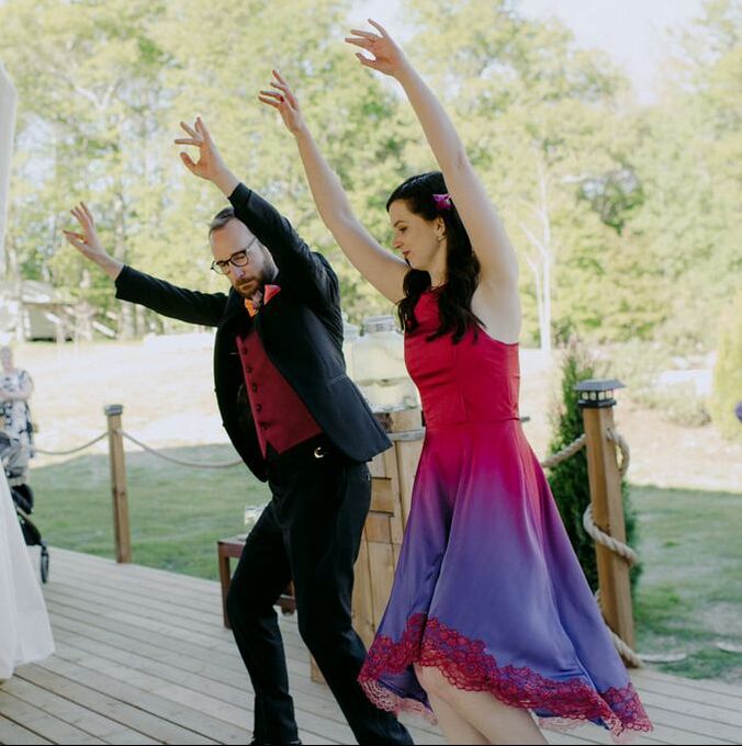
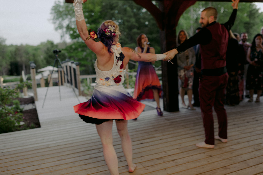 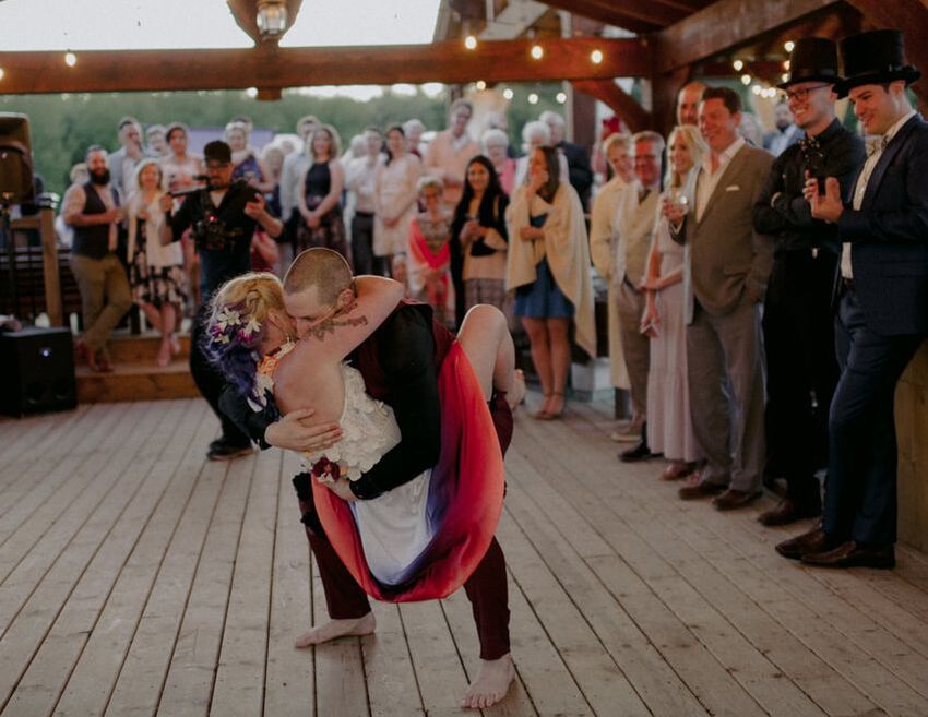 Had to rock a shorter, simplified skirt for the evening portion since we performed a choreographed dance that included multiple lifts and was sung live by my sister and her fiance. 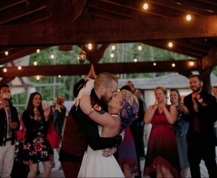 Photos: Shauna Heron
Dresses Sewing: Under the Glitter Groom’s Tuxedo: Armatura Bespoke Venue: Whispering Springs Cake: Joni and Cake Hair Styling: Ania Wazny Hair Colour: Ashley Cowen Make Up: MakeUpbyElley Dog Tuxedo: OliviasDoggieDesigns
0 Comments
|
 RSS Feed